A portfolio grid that also takes orders
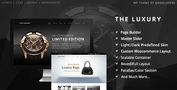
Most portfolio layouts are display cases. GoodLayers describes something slightly different for The Luxury: an add-to-cart button sits directly on the product list, and the feature list names this again as "Add To Cart (WooCommerce) Button For Portfolio Layout." A luxury item can therefore be presented as portfolio work while still being purchasable from the same listing.
That changes an editorial decision you have to make early. Watches, bags or jewellery can either live as portfolio entries with a buy action, or be handled as conventional WooCommerce products. The theme supports the first path explicitly and, according to the marketplace description, carries a built-in WooCommerce cart button in the main navigation. The vendor also says WooCommerce elements are restyled into a minimal, modern look, so the shop surface is described as designed rather than merely tolerated.
What the description does not settle is how the two product routes interact — whether a single item can exist in both places without duplication, or how the cart behaves when items are added from a portfolio listing. Those are questions for the demo.
Section skins are the theme's real styling unit
The Luxury's look is assembled section by section. The vendor describes creating a custom skin in the admin panel and assigning it to a parallax or colour section, with the stated use case being a different font colour or link colour inside that particular band. A page made of several sections can therefore carry several treatments instead of one global palette.
Parallax backgrounds are part of the same panel. The vendor says parallax speed can be set or the background fixed, and a YouTube video can serve as a section background. Together with unlimited colour options covering "almost every color elements," this puts the visual identity into section configuration rather than template editing.
The practical caution is maintenance. If each section holds its own skin and background settings, consistency across a catalogue depends on you reusing the same skins rather than inventing a new one per page.
Where the page builder starts you off
The Luxury uses the GoodLayers page builder, and the vendor mentions one convenience that matters more than the module list: a Page Builder Setting Shortcut Button. According to the description, one click applies a builder configuration suited to Homepage, About, Service, Contact 1, Contact 2 or Pricing pages.
Treat that as a head start, not completed design. The presets give a page structure to fill with your own content, imagery and skin assignments; the vendor's wording is about builder settings, not finished copy or photography. A GoodLayers Importer is also described, with the vendor saying a few steps turn the site into something like the demo site, accompanied by a step-by-step video. Note that the demo images themselves are not part of the package — the vendor states this plainly, so plan on sourcing your own photography.
Header behaviour is decided per page
The description lists a transparent or solid header option for each page. For a dark/light luxury aesthetic this is more useful than it sounds: a home page can run a transparent header over a full-screen slider, while an interior page with a lighter background uses a solid bar.
Related controls sit alongside it. Sliders come in full-screen, full-width and boxed variants. Floating navigation is available, and the layout can be boxed or full width. A Landing Page Template offers the option to disable the header, footer or both — handy for campaign pages that should not carry site chrome.
Width is set numerically rather than by fixed preset: the vendor says the container width can be entered in pixels, and the sidebar has five width options (16%, 25%, 33%, 41%, 50%), with 25% and 33% noted for layouts using both sidebars. These are admin settings, so the numbers you pick define the grid every section inherits.
Listing styles and the dark/light choice
The theme ships four portfolio styles — Classic, Classic without space, Modern, Modern without space — and four blog styles: Column, Medium, Full and Masonry. These are presentation presets for listings, not separate templates to install.
They connect back to the add-to-cart decision. A spaced classic grid gives each luxury item room and suits a small curated catalogue; a no-space modern grid is denser and pushes more items above the fold. Since the button sits on the product list, the listing style is also the shopping surface, and density affects how quickly a visitor can buy.
Dark and light pre-defined styles are listed as the theme's base options, with the vendor's demo as the place to judge how either reads with your own imagery. The description gives no detail on how thorough the light/dark switch is beyond its existence.
What the package and compatibility claims cover
The declared download contains PHP, CSS and JS files, per the marketplace attributes. Demo images are excluded, so photography licences are your own cost.
Compatibility is stated as WooCommerce 6.x through 10.x and WPML, with WordPress 6.1.x through 7.0.x listed. Those are vendor and marketplace declarations rather than results of running the theme, and the marketplace records version 1.4.7 as its latest. Browsers listed include Firefox, Safari, Chrome and Edge, plus IE11.
For context at the time of the marketplace snapshot (4 November 2026), the item showed 2,950 sales and a 4.7 rating from 103 ratings. The description is explicit that support runs through the vendor's own support site.
Questions & answers
Does the portfolio add-to-cart button work with any WooCommerce product?
The vendor describes an add-to-cart button on the product list and repeats it as a WooCommerce button for the portfolio layout. The description does not explain how portfolio entries are linked to specific WooCommerce products, so confirm that mapping in the demo before committing to the catalogue structure.
Can I mix dark and light styling on the same site?
Dark and light pre-defined styles are both listed. Beyond that, the per-section skin system lets you assign different font and link colours to individual parallax or colour sections, which is the more granular control the vendor describes.
Is the GoodLayers page builder required to use the theme?
The vendor describes the GoodLayers page builder as the theme's build tool, along with builder settings shortcuts and the GoodLayers importer. No alternative editing route is mentioned in the supplied description, so plan on using that builder for the page layouts it describes.