One colour, many shades: the palette is a constraint you have to design around
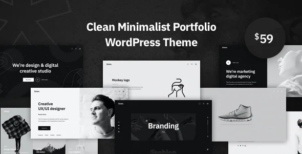
Most portfolio themes sell variety and then leave you to make the variety look coherent. Sixten's marketplace description takes the opposite position. The vendor says the colour palette is "fully balanced and built on tints and shades of the same color", adding that you will not see a colour that steps out of the general view.
That is a design rule, not a preset. It means the theme's visual harmony comes from limiting hue and varying lightness, so hierarchy has to be built with shade, spacing and type weight rather than with contrasting accent colours. If your work is bright, saturated photography, the restraint in the chrome around it is doing the work. If your brand depends on a two-colour identity, plan where that second colour is allowed to appear before you start building pages.
Worth noting alongside it: the vendor states plainly that the artwork in the theme is for presentation purposes only and asks buyers to contact the designers for permission to reuse it. Budget for your own images either way.
Seven navigation layouts, an off-canvas option and a mega menu
The feature list separates navigation into more parts than most themes bother with: seven navigation layouts, off-canvas navigation, and a mega menu described as available in the box with column and label choices. Read together, that is a recognition that a portfolio's menu changes shape depending on the body of work behind it.
A photographer with three categories needs almost nothing. A studio running services, case studies, a shop and a journal needs a mega menu with grouped columns, or an off-canvas panel that holds a longer list without crowding the header. Because the demo set includes more than ten site concepts, the reasonable expectation is that different concepts use different navigation styles — the vendor does not say which layout belongs to which concept, so treat the choice as something to confirm rather than assume.
The header can also be fixed or set to shrink on scroll, which interacts with your choice: a compact sticky header suits image-heavy pages where the menu should recede.
Footers as a layout decision, not a single global block
Unlimited footers is the claim most likely to be undersold in a feature list. The vendor describes building as many footer areas as you like and assigning each one to any page, post or portfolio item.
That changes what a footer is for. Instead of a site-wide strip of copyright and social icons, you can give a case-study page a footer that closes with a contact prompt, a journal post a footer with a newsletter field (Mailchimp support is listed), and the homepage something quieter. The assignment is per record, so the variation is deliberate rather than global.
The trade-off is administration. Every footer you create is another piece of layout you are maintaining, and there is no statement in the description about how footers behave when a template changes. A small number of well-differentiated footers will age better than one per project.
How portfolio and gallery layouts are described
The vendor names the index layouts directly: masonry, tiles, slider, grid and justified, offered for portfolio and other custom post types through a visual portfolio editor. For anyone publishing work of mixed aspect ratios, the distinction matters. Masonry and justified both absorb irregular image heights but read differently — masonry leaves an uneven edge, justified crops toward a tidy block. Tiles and grid impose a rhythm that suits consistent crops, and a slider hands pacing control to the theme.
Galleries can also pull in social feeds, with Instagram, Vimeo, Twitter, Google Photos, YouTube, Flickr and Dribbble listed as available sources. Treat that as a content-sourcing convenience rather than a substitute for uploaded work: feeds break when a platform changes its access rules, and the description does not cover how they are fetched.
Accompanying this, the vendor lists parallax backgrounds using images or video, including YouTube and Vimeo links, plus smooth CSS3 animations. The claim about speed and optimisation elsewhere in the description sits in tension with layered parallax and animation — not a contradiction, but a reason to test a real page rather than trust the adjective.
Two legitimate editing routes, and why the split matters
Sixten's editing surface is described twice, and the two descriptions serve different kinds of site owner.
The first is Elementor. The vendor claims more than 100 premade Elementor widgets, over ten website concepts including inner pages, and a live customizer with preview. If you build visually and hand off to a client, that is the route with the most ready-made scaffolding, and the one that makes demo import meaningful: the vendor says one click brings in posts, pages, images, widgets, menus and settings, and that it can take a couple of minutes.
The second route is Gutenberg. The description states the theme works with all Gutenberg blocks and enhanced block styles, and that its own shortcodes are compatible with Gutenberg; the marketplace attribute records Gutenberg Optimized as Yes. That matters for handoffs where the client should not need a builder licence or a builder tutorial to edit copy.
The two routes coexist in the marketing text without the vendor saying which one the demos are built with. Confirm that before you commit a workflow, because mixing them inside one site creates maintenance debt.
Typography, icons and the rest of the customisation surface
Font choice is unusually broad here: the vendor lists over 800 Google Fonts and over 1,200 Adobe Typekit Fonts, backed by a general claim of full typography control. In a single-hue design, type does more of the differentiating work, so the range is genuinely relevant rather than a bullet point.
Icons are handled as an upload-and-browse library, described as thousands of icons — the vendor does not name the icon set, so verify that the licence attached to your chosen icons allows commercial use. Beyond typography and icons, the vendor lists a child theme, widget-ready sidebars, a setup wizard, an admin dashboard panel showing server capabilities with links to documentation and support, translation readiness via .po files plus WPML, Contact Form 7 compatibility, and WooCommerce readiness for selling alongside the portfolio.
Points to settle before you commit
A few parts of the record need reconciling rather than repeating.
The vendor's description says the download includes premium Slider Revolution and ACF Pro. The compatibility attributes recorded on 4 November 2026 name only Bootstrap 5.x, so the plugin bundle is a vendor statement about the marketplace product; it is not something you can confirm from the attribute list, and plugin licensing terms are the vendor's to define.
The same record declares WordPress 6.0.x through 7.0.x. Attributes are declarations, not tests, and compatibility with a given WordPress release should be checked against the version you actually run. The vendor's last update date sits well before that observation date, so the practical question is which build you are working from rather than what the listing line says.
Finally, Gutenberg Optimized being Yes does not settle the Elementor question either — both are claimed. Ask which demos are built in which editor, and whether the footer and header assignments behave the same way in both.
Questions & answers
Does Sixten include a child theme?
Yes. The vendor's feature list names a child theme and describes using it to override theme files so changes survive updates. The files listed in the marketplace record are PHP, HTML, CSS, SCSS and JS.
Can I sell products with Sixten, or is it portfolio-only?
The vendor lists WooCommerce readiness and describes turning the portfolio into an online store. Nothing in the description says the shop is confined to a specific demo, but WooCommerce behaviour in a given layout is worth checking on the demo before you build around it.
Are the demo images included for use on my site?
No. The vendor states that all artwork in the theme is for presentation purposes only and directs users to contact the designers for permission. Plan on substituting your own photography or licensed assets.