Elementor reaches the header and footer, not just the page
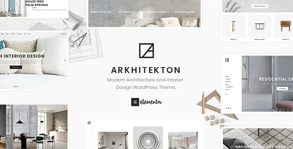
A lot of themes are Elementor-ready for body content and then hand you a separate panel for the site chrome. Arkhitekton's vendor description puts the header and footer inside the same editor: the Header & Footer Builder creates an interactive header and footer layout in Elementor using elements the theme adds, and pre-defined headers and footers can be dropped into the template library in one click. A Hero Builder and a parallax page header cover the first screen.
That matters less as a novelty and more as a budgeting question. If the top bar, sticky menu, mega menu and footer widget area all live on the canvas, plan for the header to be a design task with its own review cycle rather than a settings screen you fill in once. The vendor's claim is about what the tooling allows; it does not describe how the layout behaves against your own plugin stack.
The demo importer brings 10+ header templates and a one-minute start
The vendor says more than 10 header templates are included in the demo importer alongside the main demo, and that importing everything takes under a minute. For a studio site that is usually a handful of pages plus a project archive, that is the practical starting point instead of an empty canvas.
It does not give you a finished brand. Header templates are design options you pick and probably revisit, and the vendor states plainly that the images from the live preview are not included in the package. Architecture sites lean hard on photography, so budget for your own project shoots or a licensed library before the import can show real work.
Grid, metro and carousel repeat across portfolio, blog and shop
The project archive is the part of an architecture site people actually browse. The vendor lists three portfolio layouts — grid, metro and carousel — each with its own options, and the extended feature list adds isotope filters and a Packery layout. Isotope filters let visitors narrow projects by category without a page reload; Packery is the masonry-style arrangement that lets images of different heights sit together without a rigid row grid.
The same trio shows up for the blog as a regular grid plus masonry, metro and carousel, and again in the shop. If a site mixes case studies, journal posts and a small print shop, that consistency is worth something: you learn one set of grid controls instead of three. The listing also names a Fancybox gallery, an image lightbox and a "Powerful Portfolio Item" for single projects. Treat those names as the vendor's labels and check the demo before committing to a look.
Fifty-plus elements, shape dividers and the Inherit Option
The theme adds more than 50 elements to Elementor, according to the vendor, covering the usual blocks — icon box, image box, testimonials, counter, progress bar, accordion, toggle, video, team members in grid, carousel and metro form — plus shape dividers for the top or bottom of a section.
The detail worth noticing is the Inherit Option. The vendor explains that most element options can inherit their values from the theme options, so multiple pages or elements share the same settings without re-entering them, with inherit usually sitting at the top of the dropdown. In practice that separates global decisions — colour, typography, spacing — from local ones, and it is the lever that keeps near-identical sections consistent across project pages when someone changes the accent colour months later.
Two 1.4.x changes that affect how the theme is maintained
The changelog entries for 1.4.0 and 1.4.1 are mostly plumbing. Version 1.4.0 moved Revolution Slider and Neuron Core to cloud downloads instead of bundling them, which shrank the theme package from 10.7MB to 1.6MB, folded the demo importer into Neuron Core so the separate One Click Demo Import plugin is no longer needed, and added an updater for Revolution Slider. Version 1.4.1 refreshed the WooCommerce template files and fixed Posts element filters interfering with each other when several posts elements with query selection appear on the same page.
If you plan more than one Posts element on a page — a featured projects row above a recent journal row, say — that filter fix is the one that matters. The cloud-download change is the one that affects setup: installing those plugins becomes a step that reaches outside the theme archive. The supplied changelog excerpt ends there, so treat it as a record of specific changes rather than a complete maintenance history.
Declared compatibility and server minimums
As observed on the marketplace listing on 4 November 2026, the theme declares WordPress 6.9.x back through 5.3.x, compatibility with Elementor, WPML and Bootstrap 4.x, support for Firefox, Safari, Opera, Chrome and Edge, and files listed as PHP, CSS and JS. Documentation is described as well documented, and the layout as responsive with four or more columns.
Gutenberg Optimized is recorded as No. That attribute says where the demo layouts are constructed — Elementor — and nothing on its own about whether the block editor remains available for ordinary posts.
The vendor's server requirements are PHP 7.0 or greater, MySQL 5.6 or greater, the mod_rewrite Apache module, a 16M upload limit and a 128M memory limit. Read those as a floor. A media-heavy portfolio site with large project photography will want more headroom than the minimums imply.
Compatibility statements here come from the vendor and the marketplace listing, not from a tested run against your own plugin versions.
Questions & answers
Can I build the header and footer in Elementor, or only the page content?
The vendor's Header & Footer Builder is described as creating header and footer layouts in Elementor with theme-created elements, and pre-defined headers and footers can be added to the template library in one click. A Hero Builder covers the first screen in the same editor.
Are the demo images part of the theme?
No. The vendor's notes state that images from the live preview are not included in the package, so the photography in the demo has to be replaced with your own or licensed separately.
Which portfolio layouts does Arkhitekton provide?
Three: grid, metro and carousel, each with its own options. The extended feature list also names isotope filters and a Packery layout. The same grid, metro and carousel choice appears for blog and shop layouts.
Does the theme work with WPML for a bilingual studio site?
WPML is listed among the vendor-declared compatible plugins, and the theme is described as translation ready with support for multilingual plugins including WPML, Polylang and Loco Translate. That is a listed compatibility claim, not a tested configuration.