Three devices, three sets of decisions
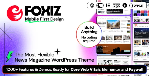
Theme-Ruby frames Foxiz as a mobile-first theme for news and magazine sites, and the claim that matters is narrower than the slogan: settings that target desktop, tablet and mobile separately rather than a single responsive grid. The vendor calls it a Responsive Settings System and lists a set of mobile-specific controls underneath it.
That distinction is worth understanding before you pick templates. A layout that only reflows usually looks acceptable everywhere and is tuned for nowhere. Phone readers on a magazine site scan headlines fast; laptop readers browse categories and open long pieces. Foxiz gives you the switches to treat those as two audiences.
Everything below comes from the vendor's marketplace description and the attributes recorded on the marketplace listing on 3 November 2026. These are claims about the theme, not observations from running it on a server.
The mobile controls, one by one
The vendor lists a Full-Screen Mobile Menu for narrow screens, plus a Mobile Menu Builder that assembles that menu inside a Ruby Template. A Quick Access Menu adds a horizontally scrolling bar for navigation on phones and tablets, and a Horizontal Scroll Effect does the same job for content blocks.
Flex Entry Meta changes which metadata appears per device, so a phone listing can drop the author and reading time that a desktop card keeps. A Live Font Size Resizer hands text sizing to the reader, which is a concrete concession for long-form reading. Flexible Featured Image sets image ratios and widths per device, with custom crops available per block.
Post listing grids support up to seven columns with adjustable spacing. Smart Mobile Layout controls how Elementor blocks present themselves on small screens, switching between list, grid and carousel. A separate mobile logo upload handles the header mark at small sizes.
Taken together, these are the settings that decide how dense your mobile homepage feels. If you have built a magazine front page that worked at 1440 pixels and became a wall of thumbnails on a phone, this is the panel you would work in.
Ruby Templates turn structure into reusable objects
Foxiz is Elementor-compatible and the vendor says it supports all Elementor layouts. The more distinctive part of the builder story is Ruby Templates, which splits into seven builders: homepage, header, footer, sidebar, single post, blog page and category. The description also says you can mix layouts from different demos.
The practical effect is that a header or a single post layout becomes something you keep and apply, rather than a demo you rebuild by hand. A publisher running news, reviews and podcasts under one brand can hold a shared header and give each vertical its own post layout.
What the description leaves out matters just as much. It does not say that editing a template updates pages already built with it, and it says nothing about revisions or rollback. Treat the builders as a way to standardise starting points, and check how an edit propagates on a staging copy before promising a client that one change reaches twenty pages.
Dark mode as a reader preference, with the flicker problem addressed
The vendor supports dark mode across all demos and describes it as a system rather than a palette swap. You can make dark mode the default, let first-time visitors choose, or follow the browser's colour scheme automatically. Colours and backgrounds are configurable per element, and a separate logo can be uploaded for dark mode.
Two details answer the usual complaints. The vendor describes intelligent browser detection that loads the correct scheme without a flicker — the white flash when a page paints light and then repaints dark. Dark-mode settings also extend to Elementor's default Grid and Container elements and most default Elementor widgets, so a page assembled from stock Elementor parts does not appear as a bright block inside a dark site.
For a news site with evening traffic this is a reading-comfort feature, and it is also the kind of setting that needs checking on real pages. The claim covers Elementor's own elements and most default widgets, not every third-party widget you might add.
Structured data is named, not just implied
Most theme descriptions promise SEO friendliness without saying what that means. Foxiz's description names the markup: News Article, Article, Review, Video and Live Blogging schema, Organization schema, and ItemList carousel markup for the homepage. Open Graph tags are described as covering not only single posts but the homepage, pages, archives, categories and author archives. The vendor also lists a fallback share image upload, input fields for organisation data, and a breadcrumb bar working with Navxt and Yoast, enhanced with schema.
These are the pieces search engines and social platforms read directly. Live Blogging schema is unusual to see listed in a theme and is the most newsroom-specific item here — it earns its keep only if you actually publish live-updating coverage.
Compatibility with SEO plugins is a separate and weaker claim. The vendor names Yoast SEO, All in One SEO, Rank Math and SEOPress. A declared compatibility is not a tested result, and schema can be duplicated or suppressed when a theme and a plugin both generate it, so decide early which system owns the markup and check the rendered page source before launch.
Selective import for a site that already has articles
The vendor lists one-click demo installation and a demo library that spans news, technology reviews, fashion, food, finance, sport, podcasts, travel, gaming and science, so most publishers will find a starting point close to their subject.
The import options are the part to plan around. Foxiz can import everything, or only pages, theme settings and widgets. The vendor presents this as protection for sites that already hold content, and it genuinely changes the risk profile: on a fresh install, importing everything gives you a full reference site; on a live site, importing content can duplicate or overwrite existing posts, which makes a pages-and-settings import the described safer route.
Either way, expect to replace demo copy and imagery. Nothing in the description suggests the import carries your editorial structure across — the demo is a layout reference, and the content work begins after it.
Paywall, personalisation and reading history: named without mechanics
The vendor's wider feature list includes paywall, personalised systems, reactions, reading history, AMP, podcast support, Mailchimp integration and GDPR compliance. For a subscription-led publication, the presence of a paywall feature is often the line between two themes, so it is worth being precise about what the evidence supports.
The description does not state a payment processor, explain how metering or member tiers are configured, or say how reading history is stored or what personalisation actually personalises. That is not proof the features are shallow; it is proof the copy stops at naming them.
If the paywall or personalisation sits at the centre of your business model, ask the vendor for specifics before building on them. A paywall usually has to connect to an existing subscription system rather than run on its own.
Declared compatibility and package facts
The marketplace attributes recorded on 3 November 2026 list Elementor and Elementor Pro, WPML, Jetpack, Contact Form 7 and bbPress 2.5.x and 2.6.x, with WooCommerce declared across 6.x through 10.x and WordPress across 5.3.x through 7.1.x. Gutenberg Optimized is marked Yes. Files included are PHP, CSS and JS, and the theme is described as responsive, widget-ready and high-resolution with child theme support.
The vendor adds implementation notes worth carrying into planning: a package described as under 3 megabytes, a codebase said to follow WordPress coding standards, additional CSS loaded only when features such as membership, recipes or shop are active, and CSS and JS files combined to reduce requests.
These are vendor declarations rather than tested results, and version ranges drift as both WordPress and the plugins move. Check the PHP and WordPress versions your host runs before committing to a build schedule.
Questions & answers
Can I build a Foxiz site in the block editor instead of Elementor?
Gutenberg Optimized is marked Yes in the marketplace attributes recorded on 3 November 2026. The documented builder features, however, are written around Elementor and Ruby Templates. If your team works in the block editor, test how closely you can reproduce a demo layout before assuming parity.
Does importing a Foxiz demo overwrite existing posts?
The vendor says you can import everything, or only pages, theme settings and widgets. On a site that already holds articles, the narrower import is the described option for avoiding disruption. Back up first and confirm the behaviour on a staging copy.
Does dark mode work with third-party Elementor addons?
The vendor states dark-mode styling covers Elementor's default Grid and Container elements and most default Elementor widgets. Widgets from other plugin vendors are outside that claim, so check them against a dark page before you rely on them.