One Home Template carries the whole introduction
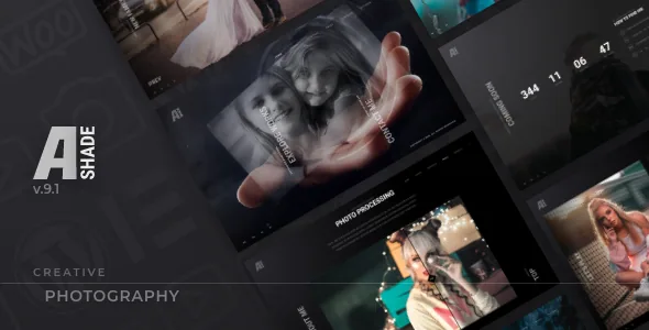
Shadow Themes describes Ashade's home page as minimal and complete: it shows your works, your contact details and a way to get in touch, "all in one simple page". The vendor lists three versions of that page — a video background, a static image, or a photo gallery using the Ken Burns effect.
Because the page is that compact, the background decision sets the tone for everything stacked on it. A video asks for a compressed clip and a judgement about whether movement competes with the thumbnails above it. The Ken Burns gallery animates your photographs before a visitor clicks anything, which suits a strong image set and works against a weak one. A static image quiets the page entirely.
The layout is something you tune rather than rebuild. Version 4.1 added horizontal position control for the Home Template links, and version 9.0 corrected the default values for the Works and Contacts links. Both entries describe a fixed editorial arrangement with adjustable furniture.
Albums and client proofing are the working content types
The feature list names a Client Proofing Page, which is the piece that separates Ashade from a portfolio theme built only around public galleries. A proofing page is a review step: a client looks at a set of photographs and responds. Keeping that separate from portfolio work implies per-client sets rather than one public album for everything.
Albums do the grouping, and the changelog shows that container being developed over years. Version 4.0 added a choice of image direction within an album — normal, reverse or random. Version 7.0 added gap and border-radius options for both album posts and album listings, an alternative cover when an album has no featured image, and layout options for listings. Version 9.0 fixed a listing where an album has neither a featured image nor photos inside.
Filters are a recurring repair subject too: version 7.0 fixed the client filter counter and added a mobile one, version 6.0 corrected the grid and adjusted-client gallery filters, and version 9.1 fixed the taxonomy filter for Shadow Elements query widgets used with the Client post type. If you publish many small client sets, that filter layer is where you will spend admin time.
Choosing among the gallery families
The vendor summarises 18 layouts for galleries and sliders. The named list is more useful: a justified grid, a grid at 2 to 4 columns, a masonry gallery at 2 to 4 columns, an adjusted grid at the same range, two bricks grid layouts, Ribbon Photography, and photo sliders in simple, fade and parallax styles.
Each answers a different question about your photographs. A justified grid keeps every image on a shared row height while preserving each file's proportions, which suits a mixed set of portrait and landscape frames. The fixed-column and masonry grids trade that fidelity for a more regular rhythm. Bricks spreads one large frame next to smaller ones when you want an asymmetric page. Ribbon is the least conventional of the set, an arrangement the changelog keeps returning to: version 4.0 fixed slide positions on screens wider than the gallery, version 5.0 added the option to show images instead of iFrames, and version 9.0 fixed item centring when the gallery is shorter than its container. Version 8.0 added a vertical Ribbon option for the albums listing on mobile.
Slider styles are a separate choice. Simple moves one image at a time, fade swaps without travel, and parallax moves layers at different rates so the amount of each frame visible changes as the slider runs. Parallax and Ribbon are the two layouts most worth checking against your own pictures before you commit, since both depend on the images' shapes lining up with the container.
Where motion helps and where it gets in the way
Smooth scroll, creative page transitions and an interactive mouse cursor are listed features, set against a "lite design without bulky loaders". Together they set a feel: pages glide, transitions bridge one page to the next, and the cursor responds to the interface.
That layer has documented costs. Version 9.1 fixed a scroll problem in Elementor when Smooth Scroll is enabled, so the two systems can interfere; if a page misbehaves after you add Elementor content, turning Smooth Scroll off is a reasonable first check. Version 5.0 added an option to disable the extra smooth scroll on touch devices, which lets you calm mobile without losing the desktop behaviour. Version 6.0 fixed a double scrollbar on the Home Template without smooth scroll while animating. The listing does not enumerate individual switches for page transitions or the cursor, so verify what the theme options expose before promising a client a particular feel.
The Before/After widget is the most concrete item in this group: a standard slider that places a straight-out-of-camera frame against a finished one. For a photographer selling retouching as part of the service, it does more persuasive work than any animation.
Elementor plus Shadow Core, and the block editor question
Elementor is the declared builder, and the theme ships Shadow Core, a companion plugin that adds its own Elementor widgets. Version 7.0 added Slider Gallery, Kenburns Gallery, Ribbon Gallery, Posts Listing, Posts Grid, Posts Ribbon and Posts Slider widgets, along with video support for the gallery widgets; version 9.0 added a Price Table item.
That split matters when you plan edits. Photo presentations are most likely dropped in as Shadow Elements widgets, while text and page structure stay with standard Elementor tools. When a gallery's appearance needs changing, look in the widget and theme options first rather than rebuilding the layout in containers.
One listing signal needs care. The marketplace marks Gutenberg Optimized as No, yet the same release that carries that label set includes a fix for the overhead caption field in the Block Editor, and version 7.0 added an option to disable the Block Editor for sidebar widgets. Block editing exists and is maintained for at least some fields, but Elementor is the surface the theme is built around. Building whole pages in the block editor is not the advertised path. Package contents are listed as PHP, CSS and JS files, so front-end customisation touches theme files and your own styles.
WooCommerce and the declared version ranges
WooCommerce appears in the feature list and in the compatibility field at versions 5.x, 6.x and 7.x. The changelog reads as commerce maintenance rather than shop design: version 4.0 added a "Sold" label for out-of-stock products and repaired responsive issues, version 5.0 fixed variable product image display, version 8.0 fixed the Add to Cart button, and version 9.0 fixed the "Continue Shopping" string translation.
So the theme can run a small print shop without obvious breakage, but the vendor describes no shop layouts or product page designs. If selling is central to the business, budget time for styling those pages yourself.
The marketplace records WordPress 6.5.x through 6.9.x as the supported range, lists version 9.1 as the latest (updated December 2024), and names Firefox, Safari, Chrome and Edge. Those are vendor and marketplace declarations, not results from running the theme on a particular server with your plugin set. What the evidence does settle: Ashade is aimed at photographic work shown large and dark, and the albums, proofing pages and gallery families are the parts that do the work.
Questions & answers
Can I build Ashade galleries without Elementor?
Elementor is the builder the theme is built and promoted around, and Shadow Core supplies gallery widgets for it. The listing marks Gutenberg Optimized as No, although the 9.1 changelog shows a Block Editor caption fix, so block editing exists for some fields but is not the advertised surface for gallery work.
What does the Client Proofing Page change about my workflow?
It gives client review its own page type, separate from public galleries. Paired with albums as the grouping container, it lets you keep each client's set apart from portfolio work and from other clients. Filters and photo counts were added for client galleries along the way, including a counter option in version 6.0 and a mobile counter in version 7.0.
How do the Ribbon and parallax layouts differ from a normal grid?
Both depend on your images fitting the container's geometry. Ribbon arranges photos in a continuous horizontal band and has collected fixes for wide screens, short containers and mobile, including a vertical mobile option added in version 8.0. Parallax slides move layers at differing rates, so the visible portion of each frame shifts while the slider runs.