Reading measure is the setting, not a preset layout choice
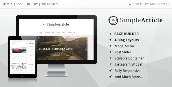
Plenty of themes describe themselves through a page builder. GoodLayers describes Simple Article through measurements. In the vendor's feature list, sidebar width is a percentage picked from five options — 16%, 25%, 33%, 41% and 50% — with 25% and 33% available for two-sidebar layouts. Container width is entered in pixels, any value you like, rather than chosen from preset boxed and full-width modes.
For a blog, that is a more useful kind of control than a canvas. Your reading measure, the distance between a post's text and the edge of the screen, is the thing readers feel on every page. Setting a sidebar to 33% says something concrete about how wide the article column becomes; choosing "sidebar left or right" does not. If you have a strong opinion about line length, this theme exposes it in the admin panel.
A page builder is listed too, but the layout arithmetic is the part with stated specifics. Read the builder as a way to assemble static pages such as an about or contact page while the blog itself is shaped by these global settings.
Four blog styles, described twice with different names
Simple Article advertises four blog styles. The feature list calls them Column, Medium, Full and Masonry. The intro paragraph describes the same set as full thumbnail, medium thumbnail with content on the side, column and masonry.
The two sentences are not identical. "Full" and "full thumbnail" line up, and "medium thumbnail with content on the side" is a clearer description of Medium than the single word is. Column and Masonry appear in both lists unchanged. Read together, the four styles describe how a listing card is arranged: an image above the text, an image beside the text, a narrow multi-column grid, or the staggered masonry grid where items of uneven height fill gaps.
The listing and the post page are separate decisions. Choosing Masonry for your archive does not change how an individual article reads. That distinction matters because many blog themes blur it, offering archive layout variants that also alter single post widths.
Post formats, sticky posts and sharing, per entry
The writing-side features are conventional for a personal blog, and the vendor names them in one run: video, audio, Soundcloud audio, galleries presented as a grid, slider or column, quote and aside. Sticky posts are supported, and social sharing appears in each post. A category filter is provided for blog posts as well.
Galleries getting three presentation options is the most practical detail in that list. A photo diary entry, a travel post and a set of screenshots want different arrangements, and picking grid, slider or column per post keeps you from installing a gallery plugin just to vary the display.
Sticky posts are worth planning around if you run a blog with standing pages — an about entry, a series index, a reading list. They let you pin those to the top of a listing without turning them into a separate menu structure. Social sharing placed inside each post, rather than floating over the whole site, keeps the buttons where a reader finishes the article.
Unlimited sidebars are listed too, so separate widget areas for different sections are available if your blog has distinct content areas.
Section skins and a page frame you can remove
Parallax and colour sections can be given their own skin. The vendor is specific about why: inside a parallax strip you often need a different font colour or link colour than the rest of the page uses. Those skins are created in the admin panel and then assigned to a section, so a dark image background does not force a rewrite of typography across the site.
Two related options sit alongside it. Sections can use a parallax background with adjustable speed or a fixed background, and a YouTube video can serve as a section background. According to the vendor, those backgrounds sit within the page builder's section model rather than as hand-coded markup.
The landing page template is the one that changes the page's frame: the vendor says its options can disable the header, the footer, or both. For a single announcement page or a newsletter prompt, removing navigation concentrates attention on what you wrote. Keep it as an exception rather than a default — a blog whose inner pages lose their navigation strands readers who arrive from search. A built-in mega menu is also listed, described as an alternative to buying a separate plugin for it.
What the listing declares, and what it leaves out
On 4 November 2026 the marketplace listing declared WordPress 6.1.x through 7.0.x and WooCommerce 6.x.x through 10.x.x, plus WPML. The file list names PHP, CSS and JS files. Widget areas are marked ready, layouts responsive at four or more columns, and high-resolution assets are claimed. Those are vendor declarations attached to the listing, not the results of running the theme against your PHP version, plugin set or host.
WooCommerce compatibility is worth separating from intent. Simple Article is listed under the personal blog category, and the vendor's shop claim is about styling: WooCommerce elements are rendered in a minimal, modern design. The description says nothing about product, cart or checkout behaviour, so if you plan to sell from a personal blog, that path needs checking in a test install.
The credits note that images from the preview site are not included in the theme package. Your homepage will not resemble the demo until you supply your own photography, and for a photo-led blog that gap matters more than any colour setting.
Questions & answers
Are Masonry and Column the same blog style?
They are listed as two of the four styles, so they are separate options. Column arranges posts in a narrower multi-column grid, while Masonry lets items of uneven height fill the gaps between them. Because the vendor's two descriptions of the four styles use slightly different wording, confirm the exact arrangement of each on the demo rather than relying on the labels.
Does the mega menu require a separate plugin?
The vendor states that the mega menu is built in and that you do not need to buy a plugin for it. Confirm menu behaviour on the demo if you plan deep navigation levels.
Can I remove the header and footer from a page?
The landing page template is described as offering options to disable the header, the footer, or both. That applies to pages built with that template, not to your blog archive by default.
Will my site look like the preview after activation?
Only after you supply your own imagery. The vendor's credits note that demo images are not included in the theme package, so the photography in the preview has to be replaced or licensed separately.