The demo photography is not yours, and the portfolio is the product
Two facts shape a Ratio project before you touch a setting. The first is in the vendor's own closing note: the images used in the theme's demos are presentational only and cannot be used on your website without a separate stock image licence. An architecture or interior theme sells itself on large, composed photography, so plan for the shoot or the stock budget rather than assuming the demo look arrives with the files.
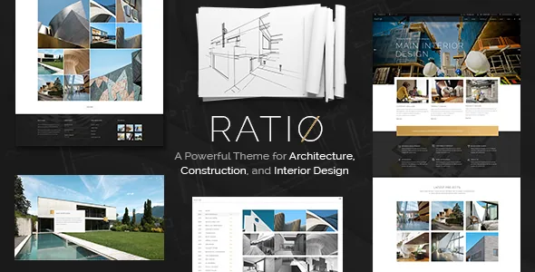
The second is scale. Edge-Themes describes Ratio as carrying 15 homepages, 25 portfolio variants, 40 shortcodes and 10 single project types. Where a general-purpose theme gives you one gallery and a filter, this one gives you a set of named presentations and expects you to choose between them. The useful question is not how many exist but which ones suit a practice that shows large, quiet images of finished buildings.
Six list layouts, six different reading rhythms
The feature list names the portfolio list layouts individually: Standard, Gallery, Masonry, Row, Pinterest and Scrollable. Those names describe how a visitor moves through a body of work, and each has a cost.
Masonry packs images of differing heights together, which accommodates a mix of portrait and landscape site photos without cropping them to one ratio, at the price of an uneven baseline. Row and Standard impose a rhythm and are easier to read in sequence. Gallery gives the images more room and fewer words. Pinterest-style lists suit a practice that wants density. Scrollable turns the index into a horizontal or continuous movement, which works well for a short, curated set and less well for an archive of ninety projects.
The list also gains animations and a portfolio category filter, so a studio can split residential, commercial and competition work and let a visitor narrow the index without leaving the page.
What a single project page can do
The single-project side is where the vendor's count of ten types becomes concrete. The feature list names Small Images, Small Slider, Big Images, Big Slider, Gallery, Split Screen, Full Screen Slider and Masonry, and adds custom portfolio layouts and an image-and-video lightbox.
The distinction that matters is how much the layout argues versus how much it displays. Big Images and Small Images leave the page to the photographs and let captions do the explaining — appropriate for a completed building where the material and the light are the point. Big Slider and Full Screen Slider add movement and pacing, which suits a practice presenting a walkthrough of a space. Split Screen fixes text on one side while imagery moves on the other, useful when a project needs a short narrative — site constraints, materials, the client's brief — beside the images.
Eight named layouts plus a custom option means you can decide per project. That is more control than most studios need, and it is also a maintenance consideration: a site with six different project templates behaves differently from one with a single template everyone learns.
Edge Slider, section backgrounds and the footer that reveals
Ratio's motion comes from an in-house slider rather than only from the bundled Slider Revolution. The feature list describes Edge Slider with image and video support, fullscreen behaviour, parallax, zoom animation on images and content entry animations. Sections separately accept video and image backgrounds, along with parallax images.
Parallax and zoom are the effects that make static architectural photography feel moving, and they are also the ones most likely to look dated or to fight a reduced-motion preference if used everywhere. Content entry animations apply to slide text, not just images.
Two other entries are distinctive enough to plan around. Variable grid size means the layout grid is adjustable rather than fixed to one column rhythm. Uncovering Footer Functionality makes the footer reveal as the page scrolls to its end — a deliberate closing gesture, which works on a portfolio homepage and can be repetitive if applied to every inner page.
The editing stack: WPBakery, Slider Revolution, Edge Core
Pages are built in WPBakery Page Builder, which the vendor lists as included, with Slider Revolution included alongside it. The changelog for version 3.0 records WPBakery updated to 8.4.1 and Slider Revolution to 6.7.34, and a separate Edge Core plugin updated to 1.6. Practical consequence: the theme ships with a composer workflow rather than the block editor, and your team's familiarity with WPBakery is a real factor in the decision.
The version 3.0 entry also records the removal of the Ratio Instagram plugin, described as a response to Instagram API changes. If a feed was part of your plan, that now sits outside the theme and needs its own solution. The same release added WooCommerce 9.x compatibility and WPML configuration updates, so the theme is still being maintained: the vendor's last recorded marketplace update is dated May 2025 in the listing, and the changelog stretches back through years of WordPress and WooCommerce compatibility entries.
Declared compatibility, and the legacy entries
The marketplace attributes recorded on 4 November 2026 declare WooCommerce 9.x and 8.x, WPML and WPBakery Page Builder among compatible plugins, WordPress versions from 6.5.x through 7.0.x, and a responsive layout at four or more columns with high-resolution assets and PHP, CSS and JS files in the package. These are vendor declarations, not a record of anyone running Ratio against your plugin set or hosting environment.
The browser list still includes IE10 and IE11 next to Firefox, Safari, Opera, Chrome and Edge. Treat the legacy entries as age markers in the declaration rather than as support you should rely on. A theme with a changelog stretching back to 2016 accumulates this kind of residue.
Where Ratio earns its place
Ratio makes sense for a practice with a substantial body of built work and a photographic budget to match: multiple project types, a need to present some projects as image sequences and others as short narratives, and a team comfortable building pages in WPBakery. The six list layouts and the named single-project layouts let you vary the reading experience deliberately rather than applying one grid everywhere.
If your work is small in number, your photography is not ready, or your team builds in the block editor, the breadth of presentation options is weight you will carry without using. The vendor's demo images are also a hard boundary regardless of which side you land on: the look in the preview is something you license and shoot, not something the theme supplies.
Questions & answers
Can I use the photos from the Ratio demo on my own site?
No. The vendor states that the demo images are used for presentation only and cannot be used on your website unless you buy the licence for them from a stock image source.
Does Ratio require WPBakery, or can I use the block editor?
The vendor lists WPBakery Page Builder as included and the changelog tracks it release by release, so the theme's own page workflow is built around that composer plus Slider Revolution. The marketplace attributes do not declare Gutenberg optimisation either way, and nothing in the supplied material describes a block-editor workflow for Ratio's layouts.
Is there an Instagram feed in Ratio?
Not as shipped. The version 3.0 changelog records the removal of the Ratio Instagram plugin because of Instagram API changes, so a feed would need a separate plugin of your own choosing.
What page and browser versions does the vendor declare?
As recorded on 4 November 2026, the listing declares WordPress 6.5.x through 7.0.x, WooCommerce 9.x and 8.x, WPML and WPBakery Page Builder. The browser list includes Firefox, Safari, Opera, Chrome and Edge alongside IE10 and IE11, which are best read as legacy entries rather than current support.