Editing happens in the Site Editor, not a theme panel
MegaTheme calls Skylab a block theme with full site editing, and the vendor's phrase for it is "visual site control" — customising the site directly on the canvas without code. That means the header, footer and templates are edited through the WordPress Site Editor, and typography and colour sit in its styles area.
If you have run themes built around one large settings screen, the adjustment is real: there is no single page collecting every colour and font choice. Block-based editing replaces it. Whether that is smoother depends on whether you already work in the Site Editor. The marketplace attributes mark Gutenberg Optimized as yes, which fits a block-theme build, and the theme is listed as widget ready, so classic widget areas remain available alongside block templates.
The grid is built for work in mixed proportions
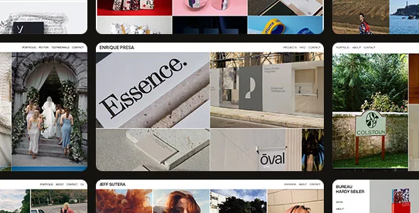
The vendor's Unified Visual Grid feature is the most specific claim in the listing: mixed-orientation artwork shown "without cropping or visual tension." A masonry layout lets a portrait scan and a landscape photograph keep their own proportions in the same column flow, which suits a portfolio of varied formats — prints, phone shots and framed stills in one gallery.
The trade-off belongs in the decision. Masonry has no shared row line, so a series shot to a consistent ratio will not sit edge to edge the way it would in a strict uniform grid. The vendor also describes arranging the showcase "in seconds," and the attributes list 4+ columns. Column count matters more here than in a fixed grid, because thin columns stretch tall portrait images further.
Fullscreen viewing decides how large your files need to be
Immersive Media View is described as expanding any visual into a clean, distraction-free fullscreen presentation. Treat it as a viewing layer over the grid: the visitor browses the masonry layout, then opens one piece on its own.
That changes where image quality matters. If the fullscreen view is where someone actually judges the work, the file has to hold up at that size, not only as a thumbnail. The marketplace marks High Resolution as yes, which supports serving a large original alongside the scaled versions WordPress generates for the grid.
The description says nothing about captions, keyboard navigation or touch behaviour in the fullscreen view. If any of those are requirements, the vendor's demo is the reference point.
Colour is adjusted in sets, with light and dark variants
Centralized Color Styling is framed as adjusting "highlights and base tones together," and Dynamic Visual Tones as switching between light and dark looks. The vendor also lists refined, pre-designed type styles.
Grouped controls keep a small palette coherent without visiting each block, and they narrow what you can change. The description does not indicate per-page accent colours; the inherited Global Styles system is where that level of control would live. The light and dark options are described as a mood choice for the site, not as a visitor-facing switch, so a reader-controlled toggle is not something the listing promises.
For photography, a dark surround reduces competition with the images, but the vendor states no default.
Demo import, files and declared compatibility
The vendor offers one-click demo import as the starting point, so templates, style variations and sample content arrive together and you inherit the grid and type choices before replacing images. Plan on editing that import into your own site rather than launching it.
The marketplace file list is narrow: PHP, CSS and JS files. No layered design source is declared, so a designer cannot count on receiving the author's layout files.
Declared compatibility observed on 3 November 2026 covers WordPress 7.0.x, 6.9.x, 6.8.x and 6.7.x, with Firefox, Safari, Opera, Chrome and Edge listed as browsers. Those are vendor and marketplace statements, not results from installing the theme on a server. A staging install with your own PHP version, caching and plugins is the only way to see how the masonry grid and fullscreen view behave together.
Where Skylab fits, and where it does not
Choose it if you want to build a photography or illustration portfolio inside the Site Editor, you show work in varying proportions, and you prefer adjusting a compact set of grouped style controls to managing a long options page.
Look elsewhere if you want one dedicated settings screen for every colour and type choice, if you need a strict uniform grid for a tightly specified series, or if you require design source files with the theme. The two features that carry most of the theme's value — the mixed-orientation grid and the fullscreen media view — are the ones the vendor description leaves partly open, so judging them with your own images is worth the time.
Questions & answers
Does Skylab need a page builder plugin?
No third-party builder is named. The vendor describes a block theme with full site editing, and the marketplace marks Gutenberg Optimized as yes, so the Site Editor is the editing model.
Can portrait and landscape images share one gallery?
The vendor presents the masonry layout specifically as a way to show mixed-orientation artwork without cropping, and a masonry grid keeps each image's proportions in the same column flow.
Are layered design source files included?
The marketplace file list names PHP, CSS and JS files only. No design source files are declared, so plan to adapt the theme's own templates.