An image can be a page with its own comments
Two entries in the vendor's photo gallery feature list carry most of the theme's character: "Enable Direct linking or Lightbox for Photos" and "Direct Linking Photos with commenting." Most gallery themes treat a photo as something that grows over the grid and then closes. Photo Nexus also lets a photo behave like a post — it has an address of its own, and readers can leave comments on it.
The same list adds "Lengthy descriptions for direct linked photos," which explains what the page version is for: room for text that a caption cannot hold. A lightbox is for a quick look; a linked photo page is for the frame that comes with a story, a location, or technical notes.
Whether you can mix the two in one gallery is the open question. The description presents them as options for photos but does not say if the choice is made per image or per gallery, so confirm that before you plan a mixed set. Either way, the linked-page route costs editorial time: each promoted image needs written copy and, if comments are left on, moderation.
Where the gallery lives: page attachments
Images are added through "Bulk image upload using Page attachments," so a WordPress page holds the set and the files stay in the media library as attachments. Nothing in the vendor list names a separate gallery plugin as a requirement, which keeps the workflow inside the theme and the core media system.
The vendor also lists "Easy sorting of Gallery images." Once a gallery runs past a couple of dozen frames, this stops being a nicety: you set the running order on purpose instead of accepting upload date, and a series can be sequenced the way you shot it.
The vendor frames the theme for people who want a convenient way to publish a self-managed gallery of photos, artworks or designs. The attachment model matches that framing — one editor curating their own images rather than a team filing into shared categories.
Slideshow controls and mixed orientations
A gallery can run as an automatic slideshow, and the vendor lists pause and resume controls with it. Auto-advance turns a set into a sequence; pause lets a reader stay with one frame. "Title and Caption feature for Slideshow" means the show can carry text as it plays.
"Landscape and Portrait Support" matters for anyone who does not crop everything to one ratio. How the two orientations are handled within a single show is not described, so bring a mixed set of your own images to the demo rather than assuming a uniform frame.
The vendor names two page templates: a Photo Gallery template and a Contact Page.
Password gates and a deliberately narrow design
A changelog entry dated 18 May 2011 records that galleries can be password protected. That is client-proofing rather than audience growth: a wedding, a commissioned shoot or a set of proofs can sit behind a shared password while the rest of the site stays open. It is one password per gallery, not an account system, so it will not manage individual client logins or expiring access.
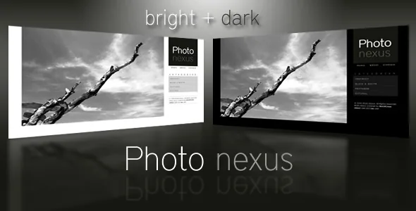
The visual direction is narrow on purpose. The vendor describes two colour variations, Bright and Dark, and calls the style modern yet minimal so the photographs hold attention. Marketplace attributes list the layout as fixed with three columns, which is a real commitment: the grid is set rather than gaining columns on wider screens. How well that reads on a phone is something to check on the demo, since a fixed layout and a three-column attribute do not say how small screens are handled.
Resizing moved off Timthumb, and the options panel grew
The changelog for version 2.1 states that Timthumb was removed and the theme now uses WordPress's built-in resizing tools. That is a meaningful change: Timthumb fetched and cached images through a bundled script, while the WordPress path works through the media system. The feature list still advertises "Dynamic image resizing" and "Dynamic thumbnail creation," so resizing remains part of the offer — only the mechanism changed.
Version 2.2 added export and import of theme options settings. Those settings are grouped as Featured, Gallery, Blog, Colors and Footer. Shortcodes cover columns, images, notices, buttons, lists and type styles, and a later changelog entry lists widgets for address, Flickr, a sidebar gallery, contact address and Twitter.
The vendor includes a help guide, lists the package as widget ready and well documented, and names PHP, CSS and JavaScript files, with code commented for customisation.
The compatibility list stops at WordPress 4.8.x
Marketplace attributes observed on 3 November 2026 list WordPress 3.9 through 4.8.x, browsers from IE6 through IE11 plus Firefox, Safari, Opera and Chrome, and a listing last updated in July 2019. Gutenberg optimisation is marked No; that attribute describes block-editor design work, not whether the block editor can load the theme. High resolution is also marked No, which matters for a photography theme.
The practical question is therefore currency, not features. The documentation, help guide and demo were built for the WordPress of that period, and nothing in the supplied information covers testing on later releases.
If the workflow above — attachments, sorting, per-photo pages with comments and password gates — is what you need, the theme was built to do exactly that. Run it on a staging copy against the WordPress version you actually use, with your plugins active, and walk one gallery end to end before you commit a client project.
Questions & answers
Can one gallery mix lightbox photos and photo pages with comments?
The vendor lists both behaviours, and the lightbox entry reads as a switch between direct linking and a lightbox view. The description does not say whether that setting applies per image or per gallery, so test the granularity on the demo before planning a mixed gallery.
Do I need a separate gallery plugin?
No plugin is named for the gallery itself. Images are uploaded as page attachments and sorted inside the gallery, so the set is handled through WordPress's own media system. The changelog also records that image resizing moved to WordPress's built-in tools when Timthumb was removed in version 2.1.
What does the password protection cover?
The changelog says galleries can be password protected, which places protection at gallery level rather than per user account. Nothing supplied covers per-client logins or access that expires on its own.
Does the fixed three-column layout affect image resizing?
They are separate settings. The attributes describe a fixed layout with three columns, while dynamic image resizing and dynamic thumbnail creation are listed as features. The vendor text does not explain how thumbnails are generated at different widths.