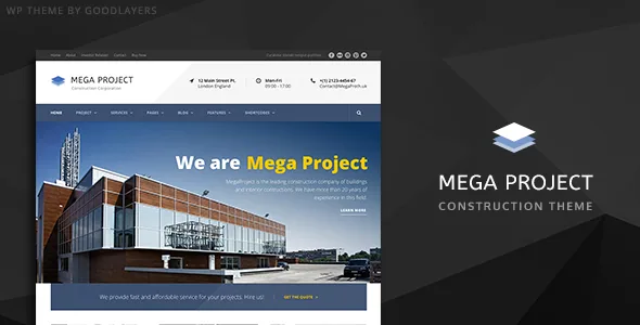
Five builder presets instead of a blank canvas
GoodLayers describes a Page Builder Setting Shortcut Button in Mega Project. According to the vendor description, one click applies a builder configuration matching Homepage, About, Service, Contact 1 or Contact 2.
Read that for what it is: a starting structure, not a finished design. The shortcut puts sections and builder settings in place so you can see how a page of that type holds together before you fill it. You still supply the copy, the project photography and the contact details, and you still decide where the sections break.
The value shows up on a construction site with a predictable page list. A firm almost always needs a home page, a services overview, an about page and at least one contact layout. Having those five configurations as a click rather than a rebuild is a saving in setup time, not a decision about how the site will look.
Projects as their own content type, in five styles
Mega Project registers a project post type, and the vendor names five listing styles for it: Classic, Classic without space, Modern, Modern without space and Medium.
The post type is the more consequential fact. Construction and engineering work is usually the strongest material a firm has, and keeping it in its own type means projects are listed, styled and linked separately from blog posts instead of being dressed up as articles.
The five styles are arrangement presets for that listing, not separate templates you install. The spaced and no-space variants change how much air sits between entries; Classic and Modern change the frame around each item; Medium changes the emphasis. For a contractor showing a handful of large builds, a spaced classic grid gives each one room. For a long list of smaller jobs, the no-space version scans faster.
The vendor does not describe whether a style chosen for the archive also governs individual project pages, so treat that as a question to answer on your own content rather than an assumption.
The slider keeps its own editing surface
The banner slider is described as a separate tool from the page builder: you arrange its elements by dragging and dropping them, and the vendor says a timeline control sets the transition period.
That second part is the useful one. Timeline-based timing means the length of each transition is something you set visually rather than through a settings field you guess at. On a construction homepage where the hero frames site photography, holding an image long enough to read and cutting quickly between two similar shots are different decisions, and the timeline is where they get made.
The vendor lists three slider widths: full-screen, full-width and boxed. Full-screen suits a single commanding image at the top of a homepage; boxed keeps the slider inside a fixed content width so it lines up with the sections below.
Layout precision: pixel container, five sidebar stops
Two controls go beyond on/off and give you numeric choices.
The container is described as scalable, with any width set in pixels. That lets you match a content width to a design reference instead of accepting a default.
The sidebar is the more unusual control. The vendor lists five widths — 16%, 25%, 33%, 41% and 50% — with 25% and 33% available when you use a sidebar on both sides. Those figures are not fluid; they are fixed stops, so the choice is picking the proportion you want rather than dialling in an arbitrary figure. A 16% sidebar is a narrow rail for related links; 33% or 41% is enough for a service list or testimonial block.
Alongside those, the vendor lists boxed or full-width layout, floating navigation, a built-in mega menu (so no third-party menu plugin is needed for multi-level navigation) and social links in the header.
Section skins: colour with a defined scope
Mega Project supports parallax and colour sections, with parallax speed adjustable or the background fixed in place.
The practical companion to a parallax band is the skin system. The vendor says you create a skin in the admin panel and assign it to a parallax or colour section, describing the use case as changing the font colour or link colour inside that band.
That is a narrower promise than a full page palette, and it is the honest way to plan with it. A dark parallax image band needs light text and a legible link colour; a pale colour section needs the reverse. Skins let you fix that per section without touching the rest of the page. The separate unlimited colour options handle broader theme colours.
The vendor does not detail which properties a skin covers beyond colour and typography, so test a skin against a real section before relying on it site-wide.
A landing page template that removes the chrome
The vendor lists a landing page template with options to disable the header, to disable the footer, or to disable both.
For a construction firm this is a campaign tool rather than a page type. A launch announcement, a tender notice, a recruitment push for site staff or a single-project microsite can all run without the full navigation of the main site, so the visitor sees one message and one action. Keeping the footer but dropping the header is the middle option, useful when you want contact details at the end without a menu bar at the top.
Because it is a template option rather than a separate install, the same theme styles carry over — the page will still look like the rest of the site even without the navigation.
What the package and compatibility claims cover
The marketplace attributes list PHP, CSS and JS files, plus PSD and Layered PSD files. The PSD inclusion matters if a designer wants to adapt demo artwork at source.
One exclusion is stated plainly in the vendor's description: images shown in the preview site are not included in the theme package. Budget for your own licensed construction photography, or your own site shots.
The declared compatibility, as observed on 4 November 2026, covers WooCommerce 6.x through 10.x, WPML, and WordPress 6.1.x through 7.0.x, with browsers listed as Chrome, Firefox, Safari, Edge and IE11. The theme description also says WooCommerce elements have been restyled into a minimal, modern look, and WPML is listed alongside it. Those are vendor and marketplace declarations; they are not a report of testing against your own plugin set, and a listed integration does not mean every page depends on it.
Support runs through the vendor's own support site, and the description points to a step-by-step video for the demo importer, which recreates demo content in a few steps.
Questions & answers
Does Mega Project depend on a third-party page builder plugin?
No. The vendor describes its own drag-and-drop page builder framework as part of the theme, along with bundled shortcodes and a shortcode generator. No separate builder plugin is named as required in the description.
Can I show construction projects separately from blog posts?
Yes. The theme registers a project post type, and the vendor lists five project listing styles: Classic, Classic without space, Modern, Modern without space and Medium. Blog posts are presented separately with four blog styles.
Are the demo images included with the theme?
The vendor description states that images in the preview site are not included in the theme package. The package attributes list PHP, CSS, JS and PSD files.