A photography theme that lives in the Site Editor
MegaTheme describes Heat as a block theme with full site editing, and that sentence does more work than any other line in the listing. There is no separate builder canvas to learn. Templates for the portfolio archive, single project pages and the front page are edited in WordPress's own Site Editor, and the vendor's claim is that you can customise every part of the site visually without touching code.
The starting point the description names is one-click demo import, with predefined typesets supplying the initial look. Treat that as a launch configuration rather than a finished design: you begin from a laid-out portfolio and then change the parts that do not match your work. If you already build in blocks, the learning curve is mostly about this theme's particular template set; if you have only ever used a drag-and-drop builder, expect to learn where global styles end and per-block settings begin.
What the theme promises about showing photographs
Two entries in the vendor's feature list deserve attention before you commit, because they describe the parts of a portfolio that are hardest to fake.
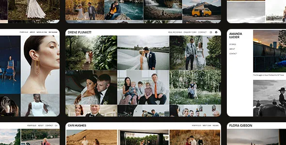
The first is labelled "Seamless Photo Grids": the claim is that vertical and horizontal shots can sit together "without any awkward cropping." That is a statement about how the grid treats differing aspect ratios, and it is worth testing against your own mixed-orientation work rather than assuming. A grid that keeps tall frames intact will produce uneven row heights; the vendor presents that as the intended effect, but you may prefer a tidier layout for a commercial set. The description also mentions a masonry gallery and fullscreen sliders in the same breath, without saying how those relate to the grid.
The second is the fullscreen media gallery: any image can be opened into a responsive fullscreen view for closer inspection. For editorial or wedding work, where a visitor may want to study a frame at size, that click path matters more than the thumbnail design. The description does not specify lightbox behaviour such as captions, keyboard navigation or zoom, so treat those as things to check in the live demo.
Palettes and typesets are theme-wide decisions
Heat's styling controls are listed as light and dark colour palettes, "unified color control" for recalibrating mood and accents, and a collection of predefined typesets. Read together, these describe a layer that sits above individual pages.
That is a different mental model from a builder where each section carries its own colour picker. Here you change palette and typography once and the change carries through the templates. It keeps a portfolio coherent, and it is the right fit if you want a fixed identity across dozens of project pages. It is a worse fit if you want one gallery to be dark and another light on the same site without extra work — the vendor does not describe per-page palette switching.
A block theme also means colours and fonts are declared in global styles, so any design change should be made there first. Editing a single block's colour to fix a page tends to leave the rest of the site inconsistent.
The site-editor route, and the marketplace's block flag
The marketplace attributes record Gutenberg Optimized as Yes, which matches the vendor's own description of a full-site-editing theme. That flag is a vendor statement, not proof of how every template was built, so it tells you the theme is intended for block editing rather than guaranteeing that no legacy markup remains in demo content.
In practice your page work is assembling blocks inside templates: the photo grid, the gallery trigger, headings and text around them. Widget-ready areas are listed, which means sidebars can still be populated from the widgets screen where a template includes one. Files in the package are given as PHP, CSS and JavaScript, which is the normal shape for a theme like this — no design source files are listed.
Declared WordPress versions and the browser list
The marketplace attributes observed on 3 November 2026 declare WordPress 7.0.x down to 6.7.x, along with compatibility for Firefox, Safari, Opera, Chrome and Edge, a responsive layout at four or more columns, and high-resolution assets.
Those are declarations from the vendor and the marketplace, not records of anyone running Heat against your PHP version or plugin set. If your site sits on an older WordPress branch, confirm where your installation is before importing demo content. Sales figures, ratings and licence pricing on the marketplace page sit outside the theme itself and say nothing about how it will behave on your host.
Heat is a photography theme rather than a general-purpose one, and the trade that comes with that focus is elsewhere: a store, complex forms or a membership layer would each need their own plugins, none of which the description addresses.
Questions & answers
Do I need a page builder plugin to build pages with Heat?
The vendor describes Heat as a block theme with full site editing, and the marketplace marks Gutenberg Optimized as Yes. Nothing in the supplied description names Elementor, WPBakery or another builder as required, so the editing surface is WordPress's own Site Editor and templates.
Can vertical and horizontal photos share one grid?
The vendor's "Seamless Photo Grids" entry says vertical and horizontal shots can be shown together without awkward cropping. How that behaves with your specific aspect ratios is worth checking against the live demo before you commit to the layout.
Does Heat support a dark and a light version of the same site?
Light and dark colour palettes are listed, with a unified colour control for accents. The description frames these as site-level styling settings rather than a per-page or per-project toggle, so plan on one palette direction across the portfolio unless you add that switching yourself.