A purchase link attached to the photograph itself
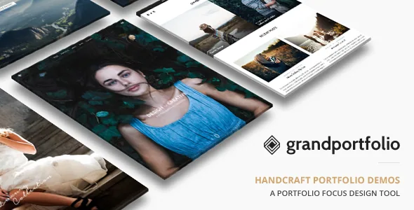
Most portfolio themes stop at making images look good. ThemeGoods' description includes a feature that goes further: a direct purchase link option for each image, sitting alongside lightbox support with touch gestures. Read together, the claim is that a visitor can open a photograph in the lightbox on a phone, swipe through the set, and follow a link from that image to wherever the print is sold.
That is an image-level setting, not a shop page you build once. The practical question is where those links point. The vendor description does not say whether the link feeds a WooCommerce product, an external print store or an arbitrary URL — it is described simply as an option per image. Before you plan a storefront around it, confirm on the demo how the field behaves and what the visitor sees when they follow it.
The gesture support matters for the same reason. Pinch and swipe on a touchscreen are how people look at photographs now, and a lightbox that depends on arrow buttons is a visible step down on a phone.
70+ gallery templates, and infinite scroll to run them
The template inventory is the largest number in the vendor's list: over 70 pre-designed templates for photo galleries and portfolios. Paired with unlimited portfolio and photo gallery pages, it describes a library you draw from rather than a single gallery layout you adapt.
Infinite scroll applies to both galleries and portfolios. It suits a large, well-edited archive where the point is that a visitor keeps finding images — scrolling replaces the decision to click to page two. On a tight set of twenty prints, it can work against you: a footer with contact details or print pricing never arrives, because there is always another batch loading. The vendor does not describe a per-page toggle for the behaviour, so check whether it can be turned off per gallery if the curated short set is your model.
The description also lists predefined single portfolio layouts importable in one click, which shortens the gap between choosing a gallery design and having a portfolio entry that matches it.
Turning responsiveness off, on purpose
Responsive layout is stated, and so is the opposite: a one-click switch in the backend to deactivate responsive features. Few themes of this vintage still advertise that control, and it is honest about the trade it makes.
Useful cases exist. A photographer who wants a fixed desktop composition to look exactly as composed — a grid whose proportions break when it reflows — may prefer the switch to fighting media queries. But it is a decision with consequences: mobile visitors then get the desktop layout, and the same description elsewhere promotes optimisation for Google's mobile-friendly check. Those two claims pull in opposite directions, so treat the toggle as a deliberate exception for a specific site, not a default.
The switch itself is described as one click in the backend. Nothing in the description suggests it restyles the mobile view into something else; it deactivates responsive behaviour.
Split screen, and eleven ways to arrange the menu
Two layout decisions stand out from the feature list because they change how a first screen reads rather than just how it is styled.
The split screen page layout puts your photography in the background of one half, with content beside it. For a single photographer's homepage that is a reasonable structure: the work occupies half the screen immediately, and the text has its own column instead of sitting on top of the image.
Menus get equal attention, with 11 layout combinations listed. The vendor also names Mega Menu support, sticky main navigation, one-page navigation and an off-canvas side menu. Those are not all one system: a sticky menu changes scrolling behaviour, one-page navigation changes what a link does, and an off-canvas menu changes where navigation lives. A portfolio with many categories usually needs the mega menu and sticky behaviour; a single-page studio site needs neither.
White and dark colour schemes are supported, which is the cheapest way to test how a photograph-heavy layout behaves on both backgrounds before committing.
Pages and portfolio entries share one builder
The vendor describes a drag-and-drop content builder with modules for portfolio, gallery, blog and testimonials, and says it supports both page content and portfolio content. A separate import/export function for the builder is also listed, which is the practical route for moving a layout between sites.
Styling sits in the WordPress Customizer, described as fully integrated with instant preview, plus custom typography controls for font size, style and colour without touching code and a colour picker for element colours. Shortcodes are also present: style shortcodes such as dropcap, column shortcodes for two to five columns, and a shortcode generator plugin.
So there are three editing surfaces — builder, Customizer, shortcodes — plus a set of built-in post types (Photo Gallery, Portfolio, Events, Testimonials, Pricing, Team Member). The duplication is a maintenance consideration, not a defect: the same columns can be produced by builder modules or by column shortcodes, and whichever you use first tends to become the standard on that site.
One item in the vendor's list sits outside the portfolio workflow and is worth naming because it can mislead: event posts are described with maps, directions and buy-ticket options. Nothing else in the description supports a bookings business, so read that as one extra content type rather than a second product.
What the declared attributes settle, and what they leave to the demo
Gutenberg Optimized is recorded as No. That is an attribute describing how the theme was built, not a statement that the block editor cannot be used — the builder described above is the theme's own, and the two are not the same thing. If your team works in blocks, the honest test is to build a page yourself.
The file list is PHP, CSS and JS: no layered design sources, so demo artwork has to be rebuilt rather than opened. Widget Ready is marked Yes and High Resolution Yes. The vendor's description also mentions a child theme, which is the route for template edits that survive updates.
Compatibility is declared for WooCommerce versions 9.x down to 6.x, WPML, bbPress 2.5.x and Facebook, with WordPress listed from 4.9.x through 7.0.x. Those are vendor and marketplace declarations observed on 4 November 2026, not results of running the theme against your own plugin set or a record of the vendor's support window. The marketplace entry itself carries a vendor update date of 6 June 2025, which is the more useful signal about how actively the theme is maintained.
Questions & answers
Do I need WooCommerce to sell a photograph through the per-image link?
Not necessarily. The vendor lists a direct purchase link option on each image and, separately, WooCommerce compatibility for shopping cart features. Those are two different claims: the link can point wherever you set it, and the description does not say it creates a cart product. If you want checkout inside the site, plan on building the WooCommerce side yourself and testing the link against it.
Can the theme be served as a fixed desktop layout?
The vendor says responsive features can be deactivated with one click in the backend. That is a switch, not an alternative mobile design. Mobile visitors would receive the desktop layout, so the mobile-friendly optimisation mentioned elsewhere in the description should not be assumed to still apply.
Is the block editor unusable because Gutenberg Optimized is marked No?
No such conclusion follows. The attribute says the theme was not built specifically for the block editor; the theme ships its own drag-and-drop builder. Whether your block-based workflow runs cleanly with it is something to test rather than infer from a single field.